The purpose of the application is to allow ordering dishes in a convenient and fast way from a large restaurant chain that has many branches.
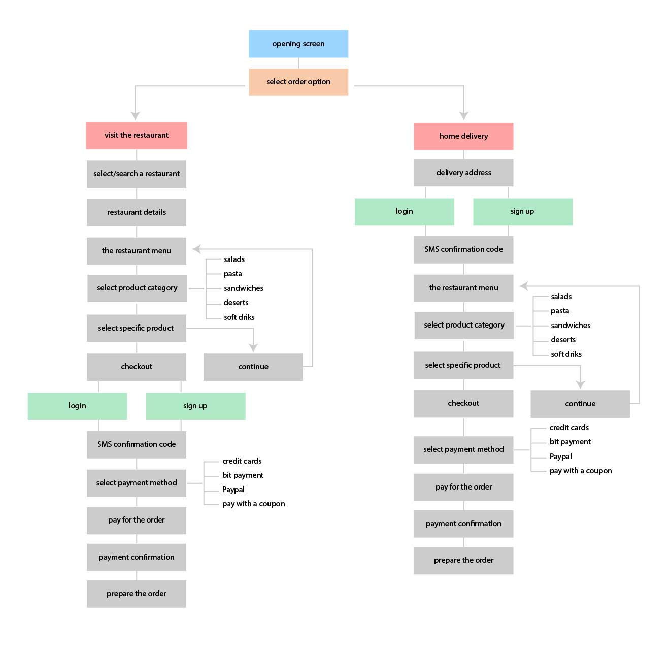
The application offers the user two options:
The restaurant offers fresh and varied Mediterranean-style food that actually allows you to order food for the whole family at reasonable prices.
The big challenge is to build an application with a simple interface that allows fast and convenient ordering for every user, even for users who are less technologically savvy and those who are not used to ordering via smartphone.
The goal is to avoid a complicated registration process and filling out unnecessary forms. Users must also be allowed to pay in a variety of ways and also enjoy coupons and discounts.
A. In the first step, I did extensive research on the Internet to locate the top 5 apps for ordering prepared food from restaurants and reserving seating.
B. In the next step, I looked for users who usually book places in restaurants online and also order delivery of dishes. I presented them with the top 5 apps I found and asked them several questions to compare the apps:
After the interviews I came to several conclusions:
I made a site map for two types of users: the first is the one who chooses to visit the restaurant and the second is the one who wants to order delivery to his home
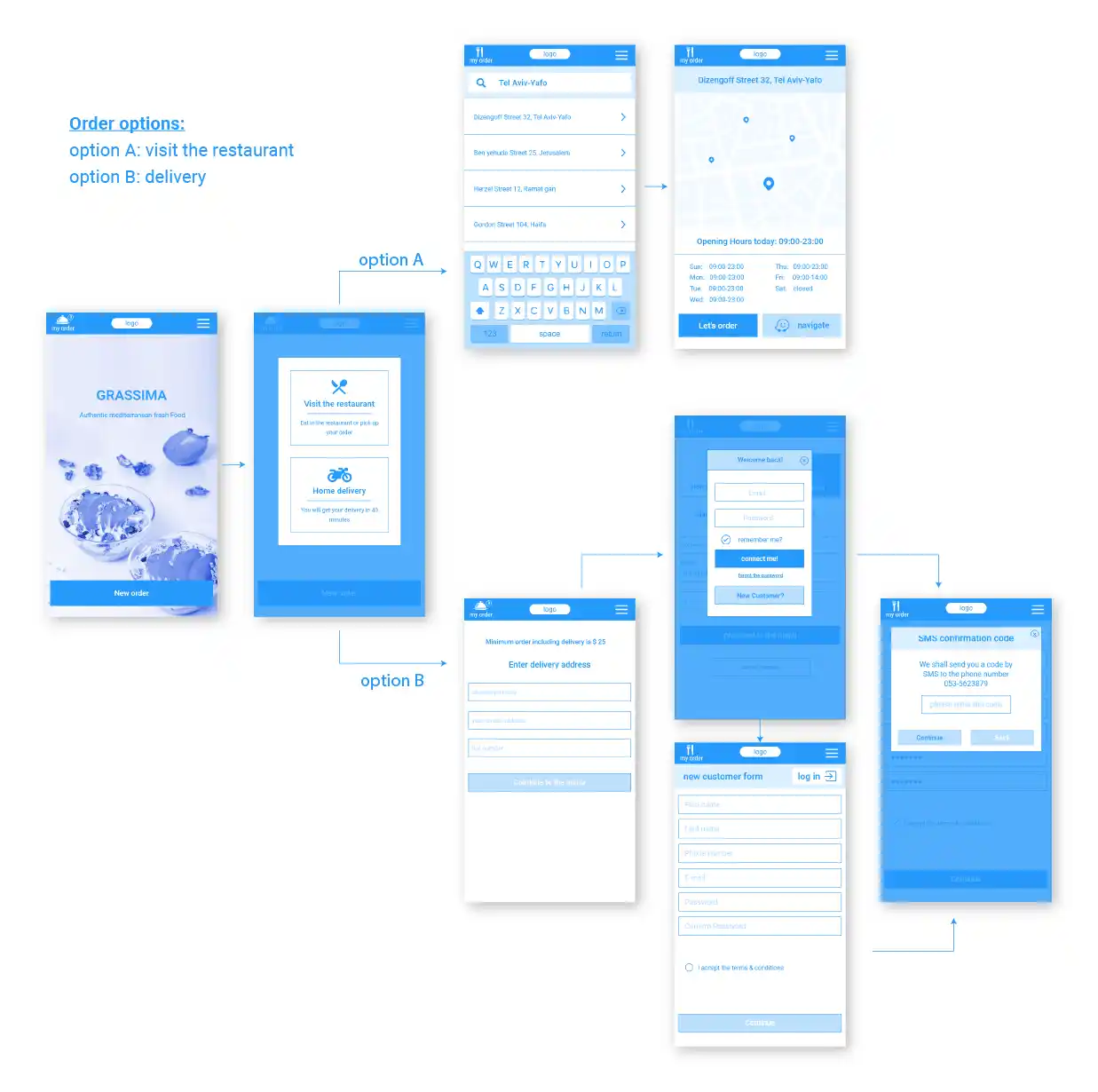
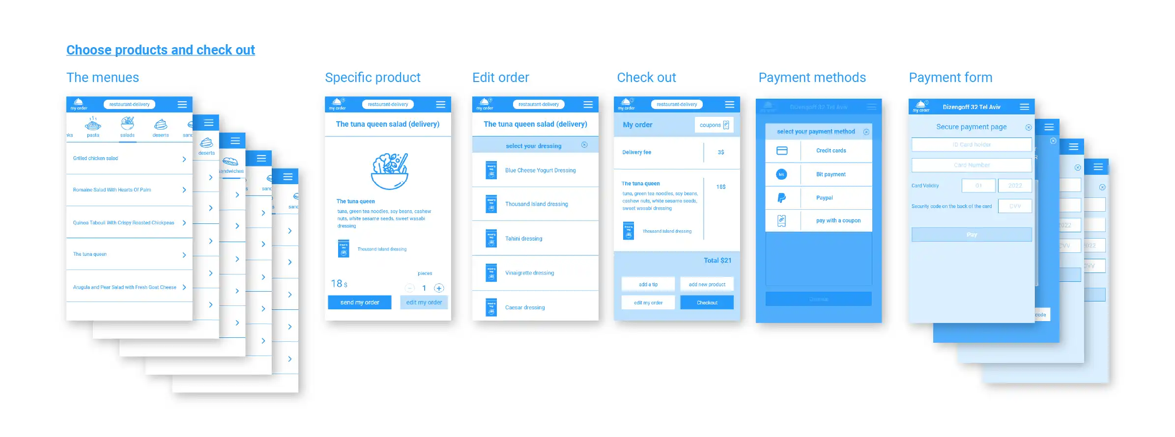
According to the site map, I prepared wireframes that follow the user’s steps and the transitions between the different screens
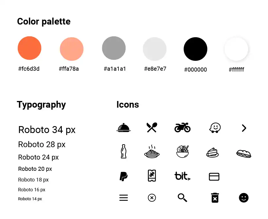
The design phase included designing a logo, choosing a color palette, fonts, icons and more
After I finished the user interface design, I assembled a group of several users and asked them to use the application to test how user-friendly the application is.
I asked the users to perform several actions:
After analyzing the data I came to several conclusions:
The users easily located the desired restaurant branch and were able to make complex orders without any particular difficulties.
At the same time, I came to the conclusion that I should make several improvements to the application: